
Over a few days this past summer I took to drawing the world. Or, well, linework of it. More recently I cobbled together a font based off my own handwriting. Why? Read on.
I
Almost all Cartographers like their data percise and accurate. Therefore almost everyone uses the same georeferenced linework as a base for their maps.
Still, not all maps need such percision! As Daniel Huffman Daniel is a freelance Cartographer, lecturer, and all around smart guy. He runs somethingaboutmaps puts it:
“[Project Linework is a] library of handcrafted vector linework for cartography, each designed in a unique aesthetic style. They are meant to break us away from default line paths that we so often rely on by providing more visually-interesting alternatives.”
A great comparison are fonts. The root goals for a font are that it A) has clear, distinct letters, & B) that it is consistent. We could very well just use Arial for everything. But we don’t as we know type can be manipulated to better convey the mission; whether that be selling milk, promoting art, or just letting folks know casual Friday is coming up.
In occasional cases, even geographic ones, precision can take a back seat to pushing a mood.
II
We wanted to make a linework that looked hand drawn, but not inaccurate to the point of it being useless. I first tried to eyeball it… which went disastrously. Next I tried tracing a print out of an accurate base but that proved too close. It just resembled shaky-cam NaturalEarthData.
We determined the best way to get a nice balance was to use our print out of NaturalEarthData as a base and make markers around the boundaries- at tips of coasts or where country borders split. Then I’d eyeball the spaces in between doing it freehand.
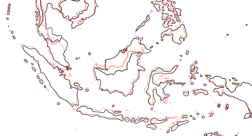
For example, for Florida I marked where the south-most tip was, where it bent to, and then drew in the rest. This put things in roughly the right place with enough flourishes and errors for it to truly look manmade.
As for converting the sketch I did into a Shapefile, well, that’s something you would need to bug Daniel about. After we both cleaned up the scanned drawing, he took to actually georeferencing it in ArcGIS. As I understand it, it was very tedious and I can’t thank him enough for taking it on. Thanks Daniel!
III
It always feels great when you want to do something and the first Google result provides a super easy method.
In this case, I used http://www.myscriptfont.com/ to generate a font out of my handwriting. You just download their template, draw on it, re-upload it, and bang. You’ve got yourself a font.
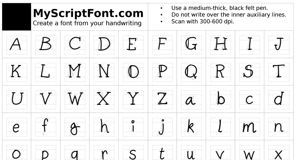
It took a few tries to get something that looked fairly consistent in it’s weight & heights. It could certainly use some further tweaking, but the unevenness is much more true to my actual handwriting. Here’s an example:
When the motorcyclist Johnny Blaze finds that his father Barton Blaze has a terminal cancer, he accepts a pact with the Mephistopheles, giving his soul for the health of his beloved father. But the devil deceives him, and Barton dies in a motorcycle accident during an exhibition. Johnny leaves the carnival, his town, his friends and his girlfriend Roxanne. Years later Johnny Blaze becomes a famous motorcyclist, who risks his life in his shows, and he meets Roxanne again, now a TV reporter. However, Mephistopheles proposes Johnny to release his contract if he become the “Ghost Rider” and defeat his evil son Blackheart, who wants to possess one thousand evil souls and transform hell on earth.
The immediate reason of making this font was to help launch a part of this website that I could use to write letters to folks and still make them feel more endearing than a regular old email would. After making it though, it’s been fun to break out for miscellanious side projects.
IV
And with that, we have a sketchy georeferenced artwork that folks can use for their maps. We can project it, as well as layer other georeferenced data on top of it. I also have a font that’s unique to myself to boot.
Feel free to use either of these for your projects. I’d love to see them in the wild.
Enjoy!